Graphic Design for Email Marketing: Dos and Don'ts
Posted by: Ali Jaffar Zia
December 5, 2023
Email marketing continues to be one of the most effective channels for businesses to connect with their audiences. However, in an overcrowded inbox, the visual appeal of your emails can make all the difference. In this blog, we'll explore the dos and don'ts of graphic design for email marketing, with a focus on the key elements that drive engagement and conversion.

The Impact of Email Marketing
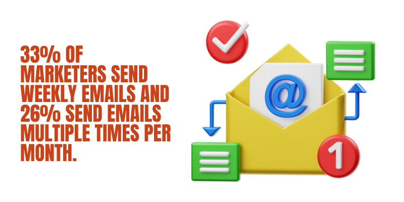
Before diving into graphic design, it's essential to understand the impact of email marketing. The numbers don't lie:
Now, let's explore the dos of graphic design for email marketing:
Dos of Graphic Design for Email Marketing
1. Optimize for Mobile: With more people accessing emails on mobile devices, it's imperative to ensure your email design is responsive. In 2021, mobile devices were responsible for 63.9% of all email opens, according to Litmus.
Ensure that your emails adapt to various screen sizes, providing a seamless user experience on smartphones and tablets.
2. Clear and Compelling CTAs: The Call-to-Action (CTA) is the driving force behind email conversions. According to a study by Campaign Monitor, emails with a single CTA increased clicks 371% and sales 1617%.
Use contrasting colors, persuasive text, and clear positioning to make your CTAs stand out and compel recipients to take action.
3. Consistent Branding: Consistency in branding across all your marketing materials can boost brand recognition by 80%, according to Lucidpress.
Ensure that your emails incorporate the same color schemes, fonts, and logos as your website and other marketing materials to create a unified brand image.
4. Eye-catching Visuals: Visual content is processed 60,000 times faster by the brain than text, as reported by 3M Corporation. Therefore, it's crucial to include eye-catching images and graphics in your emails. These are the best tips for graphic design for email marketing strategies.
10 Social Media Design Tips for Creating Engaging Graphics (attrock.com)
High-quality visuals can increase engagement and conversion rates significantly. For example, HubSpot found that adding images to your emails can boost click-through rates by 42%.
5. Readable Typography: Typography plays a crucial role in the readability of your email content. According to Crazy Egg, 66% of people prefer to read something beautifully designed rather than something plain.
Choose fonts that are easy to read, and be mindful of font size and line spacing to enhance the legibility of your text.
6. Personalization: Personalization is the secret sauce of email marketing success. In fact, a study by Evergage found that 88% of marketers see a measurable lift in business results from personalization.
Tailor your emails to individual preferences, including the recipient's name, location, or past interactions with your brand, for a more personalized experience.
7. A/B Testing: A/B testing allows you to fine-tune your email design for optimal results. According to Invesp, A/B testing can increase conversions by up to 300%.
Experiment with different design elements, such as CTA button colors or email subject lines, to identify what resonates best with your audience.
Don'ts of Graphic Design for Email Marketing
1. Overwhelming Design: An overly complex email design can overwhelm recipients, leading to lower open and click-through rates. According to a study by Microsoft, the average human attention span has decreased to just 8 seconds.
2. Neglecting Mobile Users: Ignoring the mobile-friendliness of your emails can lead to frustration and decreased engagement. According to Adestra, 79% of email opens occur on mobile devices.
Ensure your emails are responsive to provide a seamless experience for mobile users.
3. Image-Heavy Emails: Relying solely on images in your emails can lead to slower load times and reduced engagement. According to Campaign Monitor, emails with too many images can trigger spam filters.
Balance text and images to maintain a healthy email deliverability rate. Top 5 Simple Graphic Design Strategies For Small Businesses (needmomentum.com)
4. Inconsistent Branding: Inconsistency in branding can confuse recipients and erode trust. According to Lucidpress, brand consistency can increase revenue by up to 23%.
Stick to your brand guidelines across all email campaigns to maintain a professional image.
5. Unoptimized File Sizes: Large image file sizes can slow down email load times. According to Google, 53% of mobile site visitors leave a page that takes longer than three seconds to load.
Optimize images for the web to ensure faster email loading.
6. Ignoring Spam Filters: Certain design practices, such as excessive use of capital letters or misleading subject lines, can trigger spam filters. According to Statista, 47% of email is classified as spam.
Be mindful of design elements that can lead to your emails being marked as spam.
7. Excessive Text: Lengthy, text-heavy emails can overwhelm recipients and lead to decreased engagement. According to Nielsen Norman Group, people tend to scan rather than read emails.
Keep your email content concise and to the point.
How does an email layout and design impact click-through rate and lead generation?
The graphic design of an email plays a crucial role in improving the click-through rate (CTR) and lead generation in an email marketing campaign. Here's how graphic design for email marketing works when it comes to lead generation:
1. Grabbing Attention: An eye-catching and well-designed email stands out in a recipient's crowded inbox. The first step in getting someone to click on your email is to capture their attention. High-quality visuals, appealing color schemes, and a well-structured layout can draw the recipient's eye and make them more likely to engage with your email. In fact, a study by the Radicati Group found that people receive an average of 121 emails per day, so the importance of making yours stand out cannot be overstated.
2. Clear Call-to-Action (CTA): A well-designed CTA button that is visually appealing and strategically placed in the email can significantly impact CTR. When the CTA is clear and enticing, recipients are more likely to click on it. Good graphic design can make the CTA button, along with its surrounding elements, stand out and guide the recipient's attention toward it.
3. Visual Storytelling: Humans are highly visual creatures. Engaging graphics, images, and infographics can help convey your message or value proposition more effectively than plain text. Visual storytelling through graphic design can create an emotional connection with your audience and make them more inclined to take action. For example, a visually appealing product image can entice someone to click and learn more.
4. Brand Consistency: Consistency in graphic design with your brand's visual identity is crucial. When recipients open your emails, they should immediately recognize your brand. This consistency builds trust and credibility. According to Lucidpress, brand consistency can boost recognition by 80%. When recipients trust your brand, they are more likely to click on your emails and engage with your content.
5. Personalization: Effective graphic design can also facilitate personalization in your emails. Personalizing emails with the recipient's name, location, or other relevant information can make the email feel tailored to their needs. According to Evergage, 88% of marketers see a measurable lift in business results from personalization. Customized visuals and designs that resonate with the recipient can encourage them to click through and explore further.
6. Visual Hierarchy: Graphic design for email marketing helps establish a clear visual hierarchy within the email. Key information and the CTA should be prominent, while less critical elements are de-emphasized. This makes it easier for recipients to quickly grasp the message and decide to click on the CTA.
7. Mobile Responsiveness: With the majority of emails being opened on mobile devices, responsive design is essential. Proper graphic design ensures that your email looks and functions well on various screen sizes. If your email doesn't display correctly on mobile devices, you risk losing potential leads who prefer to engage with emails on their smartphones or tablets.
The graphic design of an email can have a profound impact on click-through rates and lead generation in email marketing campaigns. Well-designed emails capture attention, guide the recipient's focus, create a strong brand presence, and facilitate personalization. When recipients find emails visually appealing and easy to interact with, they are more likely to click on CTAs and take the desired actions, ultimately leading to increased CTR and the generation of valuable leads.
Conclusion
Effective graphic design for email marketing is not just about aesthetics; it's about achieving tangible results. By optimizing for mobile, creating compelling CTAs, maintaining brand consistency, using eye-catching visuals, and personalizing content, you can improve email engagement and conversion rates. On the other hand, avoiding overwhelming design, neglecting mobile users, minimizing image-heavy emails, ensuring consistent branding, optimizing file sizes, staying spam filter-friendly, and keeping text concise will help you create effective email campaigns that resonate with your audience.
By following these dos and don'ts, you can harness the power of graphic design to maximize the impact of your email marketing efforts and, in turn, boost your ROI. The statistics and data mentioned throughout this blog post underscore the importance of these design practices in achieving success in the realm of email marketing.
More blogs you may like to read.
Learn more about Strategic Connection's Content Marketing Services. 
